From time to time I get asked to design a poster for a project and it has always been a struggle. Be it at university, work or on any kind of conference, a poster presentation is quite helpful to get across small project ideas, but it can be just painful if it fails to support a message.
There are loads of recommendations on poster design in the net and almost any university or company has its own guidelines. Learning about some basic rules that address the use of layout, graphics and especially fonts is essential. Though inevitable and quite effective I personally think is to keep an eye on the work of fellow students and colleagues. Just by strolling through conference halls it is possible to generate new ideas, adapt handy methods or to just observe epic failure that clearly needs to be avoided in a future project. Unfortunately most posters get thrown away once a conference ends, which is a pity for some of them.
That said, I would like to share some of my posters, noting that all of them lack of any kind of professional background. Please do not understand this as an example show for recommended design but note that all of them have been presented in a more or less professional and diverse context with general recognition.
Siggraph Poster
The automated interior designer is a project we presented at Siggraph in 2008. Our intention with this poster was to create an understanding of a fairly conceptional algorithm as well as the idea behind its design.
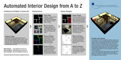
pro: The flow. The focal point is the result which is smoothly separated from the approach itself. Though it's a bit tricky, most of the audience gave their second glance to the approach, already understanding what the result will be. In addition the comparability of problem and result are immediately accessable and give room to the two major steps of the algorithm.
con: There is a lot of text on this one. Fortunately Siggraph has an academic context with people who are incredibly curious. A lot of them took the time to go through it but in any other context I'd rather opt for less text and more self-explanatory graphical elements.
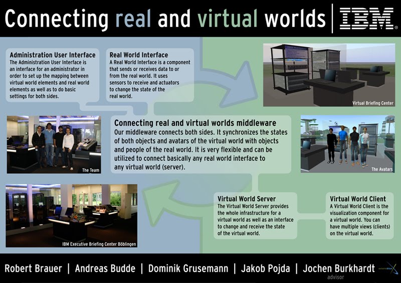
Business Poster
Connecting real and virtual worlds has been one of the IBM Extreme Blue projects in 2008. Our intention with this business poster was to demonstrate the components as well as the structure of a software system to crosslink real and virtual entities.
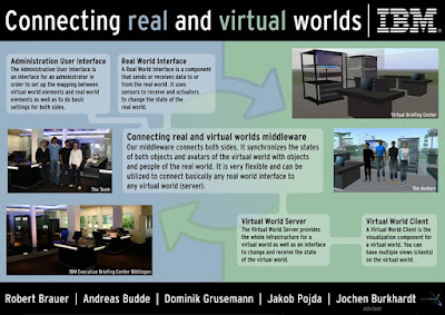
pro: Though a little bit pale, the subtle mirroring contrast of both worlds and their interplay has been received. We took this understanding to explain the interaction of the components inside the system. That worked quite well.
con: Apart from emphasizing the mirrored crosslink of real and virtual entities, the pictures are pretty meaningless. In addition the whole poster is visually blurred which becomes clear by telling that the role of the middleware is the most important aspect in this one.
UbiComp Poster
This poster has been made in support to a publication at UbiComp 2009. The intention in this case was to show the whole project from an initial motivation to the final prototype.
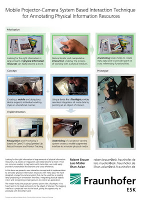
pro: Even without anybody around to explain what the project is about it has been possible to understand what is happening here. Despite the textual heap also subtle color coding and indicators support the concept. In a very retentive way though.
con: Reservation and again... if there is one argument to justify this approach, it would be its academic context.
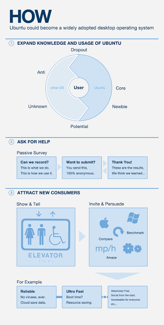
University Project Poster
This one is from a HCI course at UCL in 2010. The idea behind it was to present a product by highlighting its development process based on user centered design.
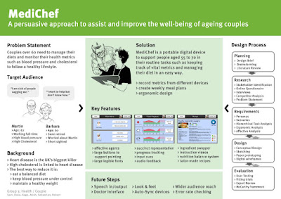
pro: There is a clear visual separation between the analysis on the left, the product in the center and the detailed approach to its right.
con: Unfortunately this one misses to open the door for understanding the product itself. There is no catching element on the poster and just a quite passive representation of the solution. Hence it failed to focus attention and made the solution hardly accessable.